
Note
Go to the end to download the full example code.
Nuclear Magnetic Resonance (NMR) dataset
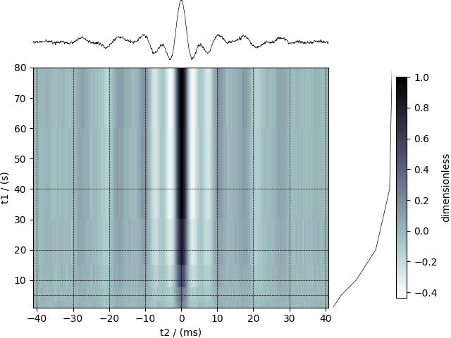
The following example is a \(^{29}\mathrm{Si}\) NMR time-domain saturation recovery measurement of a highly siliceous zeolite ZSM-12. Usually, the spin recovery measurements are acquired over a rectilinear grid where the measurements along one of the dimensions are non-uniform and span several orders of magnitude. In this example, we illustrate the use of monotonic dimensions for describing such datasets.
Let’s load the file.
import csdmpy as cp

filename = "https://www.ssnmr.org/sites/default/files/CSDM/NMR/satrec/satRec.csdf"
NMR_2D_data = cp.load(filename)
print(NMR_2D_data.description)
A 29Si NMR magnetization saturation recovery measurement of highly siliceous zeolite ZSM-12.
The tuples of the dimension and dependent variable instances from the
NMR_2D_data instance are
respectively. There are two dimension instances in this example with respective dimension data structures as
print(x[0].data_structure)
{
  "type": "linear",
  "count": 1024,
  "increment": "80.0 µs",
  "coordinates_offset": "-41.04 ms",
  "quantity_name": "time",
  "label": "t2",
  "description": "A full echo echo acquisition along the t2 dimension using a Hahn echo.",
  "reciprocal": {
    "coordinates_offset": "-8766.0626 Hz",
    "origin_offset": "79578822.26200001 Hz",
    "quantity_name": "frequency",
    "label": "29Si frequency shift"
  }
}
and
print(x[1].data_structure)
{
  "type": "monotonic",
  "coordinates": [
    "1 s",
    "5 s",
    "10 s",
    "20 s",
    "40 s",
    "80 s"
  ],
  "quantity_name": "time",
  "label": "t1",
  "reciprocal": {
    "quantity_name": "frequency"
  }
}
respectively. The first dimension is uniformly spaced, as indicated by the linear subtype, while the second dimension is non-linear and monotonically sampled. The coordinates along the respective dimensions are
[-41040. -40960. -40880. ... 40640. 40720. 40800.] us
[ 1. 5. 10. 20. 40. 80.] s
Notice, the unit of x0 is in microseconds. It might be convenient to
convert the unit to milliseconds. To do so, use the
to() method of the respective
Dimension instance as follows,
[-41.04 -40.96 -40.88 ... 40.64 40.72 40.8 ] ms
As before, the components of the dependent variable are accessed using the
components attribute.
y00 = y[0].components[0]
Visualize the dataset
The plot() method is a very basic supplementary function for
quick visualization of 1D and 2D datasets. You may use this function to plot
the data from this example, however, we use the following script to
visualize the data with projections onto the respective dimensions.
import matplotlib.pyplot as plt
from matplotlib.image import NonUniformImage
import numpy as np

# Set the extents of the image.
# To set the independent variable coordinates at the center of each image
# pixel, subtract and add half the sampling interval from the first
# and the last coordinate, respectively, of the linearly sampled
# dimension, i.e., x0.
si = x[0].increment
extent = (
    (x0[0] - 0.5 * si).to("ms").value,
    (x0[-1] + 0.5 * si).to("ms").value,
    x1[0].value,
    x1[-1].value,
)

# Create a 2x2 subplot grid. The subplot at the lower-left corner is for
# the image intensity plot. The subplots at the top-left and bottom-right
# are for the data slice at the horizontal and vertical cross-section,
# respectively. The subplot at the top-right corner is empty.
fig, axi = plt.subplots(
    2, 2, gridspec_kw={"width_ratios": [4, 1], "height_ratios": [1, 4]}
)

# The image subplot quadrant.
# Add an image over a rectilinear grid. Here, only the real part of the
# data values is used.
ax = axi[1, 0]
im = NonUniformImage(ax, interpolation="nearest", extent=extent, cmap="bone_r")
im.set_data(x0, x1, y00.real / y00.real.max())

# Set up the grid lines.
ax.add_artist(im)
for i in range(x1.size):
    ax.plot(x0, np.ones(x0.size) * x1[i], "k--", linewidth=0.5)
ax.grid(axis="x", color="k", linestyle="--", linewidth=0.5, which="both")

# Setup the axes, add the axes labels, and the figure title.
ax.set_xlim([extent[0], extent[1]])
ax.set_ylim([extent[2], extent[3]])
ax.set_xlabel(x[0].axis_label)
ax.set_ylabel(x[1].axis_label)
ax.set_title(y[0].name)

# Add the horizontal data slice to the top-left subplot.
ax0 = axi[0, 0]
top = y00[-1].real
ax0.plot(x0, top, "k", linewidth=0.5)
ax0.set_xlim([extent[0], extent[1]])
ax0.set_ylim([top.min(), top.max()])
ax0.axis("off")

# Add the vertical data slice to the bottom-right subplot.
ax1 = axi[1, 1]
right = y00[:, 513].real
ax1.plot(right, x1, "k", linewidth=0.5)
ax1.set_ylim([extent[2], extent[3]])
ax1.set_xlim([right.min(), right.max()])
ax1.axis("off")

# Add the colorbar and the component label.
cbar = fig.colorbar(im, ax=ax1)
cbar.ax.set_ylabel(y[0].axis_label[0])

# Turn off the axis system for the top-right subplot.
axi[0, 1].axis("off")

plt.tight_layout(pad=0.0, w_pad=0.0, h_pad=0.0)
plt.subplots_adjust(wspace=0.025, hspace=0.05)
plt.show()
Total running time of the script: (0 minutes 0.298 seconds)