
Note
Click here to download the full example code
Meteorological, 2D{1,1,2,1,1} dataset
The following dataset is obtained from NOAA/NCEP Global Forecast System (GFS) Atmospheric Model and subsequently converted to the CSD model file-format. The dataset consists of two spatial dimensions describing the geographical coordinates of the earth surface and five dependent variables with 1) surface temperature, 2) air temperature at 2 m, 3) relative humidity, 4) air pressure at sea level as the four scalar quantity_type dependent variables, and 5) wind velocity as the two-component vector, quantity_type dependent variable.
Let’s import the csdmpy module and load this dataset.
import csdmpy as cp

filename = "https://osu.box.com/shared/static/6uhrtdxfisl4a14x9pndyze2mv414zyg.csdf"
multi_dataset = cp.load(filename)
The tuple of dimension and dependent variable objects from
multi_dataset instance are
The dataset contains two dimension objects representing the longitude and latitude of the earth’s surface. The labels along thee respective dimensions are
x[0].label
Out:
'longitude'
x[1].label
Out:
'latitude'
There are a total of five dependent variables stored in this dataset. The first dependent variable is the surface air temperature. The data structure of this dependent variable is
print(y[0].data_structure)
Out:
{
  "type": "internal",
  "description": "The label 'tmpsfc' is the standard attribute name for 'surface air temperature'.",
  "name": "Surface temperature",
  "unit": "K",
  "quantity_name": "temperature",
  "numeric_type": "float64",
  "quantity_type": "scalar",
  "component_labels": [
    "tmpsfc - surface air temperature"
  ],
  "components": [
    [
      "292.8152160644531, 293.0152282714844, ..., 301.8152160644531, 303.8152160644531"
    ]
  ]
}
If you have followed all previous examples, the above data structure should be self-explanatory.
We will use the following snippet to plot the dependent variables of scalar quantity_type.
import numpy as np
import matplotlib.pyplot as plt
from mpl_toolkits.axes_grid1 import make_axes_locatable


def plot_scalar(yx):
    fig, ax = plt.subplots(1, 1, figsize=(6, 3))

    # Set the extents of the image plot.
    extent = [
        x[0].coordinates[0].value,
        x[0].coordinates[-1].value,
        x[1].coordinates[0].value,
        x[1].coordinates[-1].value,
    ]

    # Add the image plot.
    im = ax.imshow(yx.components[0], origin="lower", extent=extent, cmap="coolwarm")

    # Add a colorbar.
    divider = make_axes_locatable(ax)
    cax = divider.append_axes("right", size="5%", pad=0.05)
    cbar = fig.colorbar(im, cax)
    cbar.ax.set_ylabel(yx.axis_label[0])

    # Set up the axes label and figure title.
    ax.set_xlabel(x[0].axis_label)
    ax.set_ylabel(x[1].axis_label)
    ax.set_title(yx.name)

    # Set up the grid lines.
    ax.grid(color="k", linestyle="--", linewidth=0.5)

    plt.tight_layout()
    plt.show()
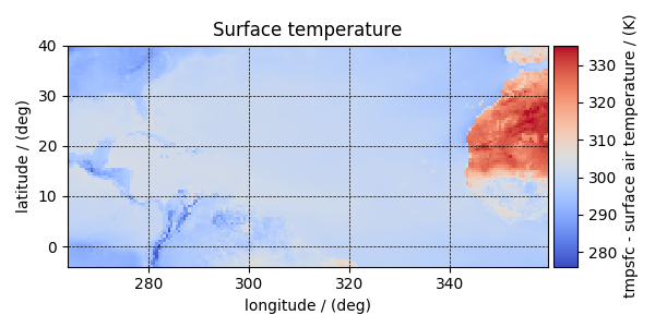
Now to plot the data from the dependent variable.
plot_scalar(y[0])
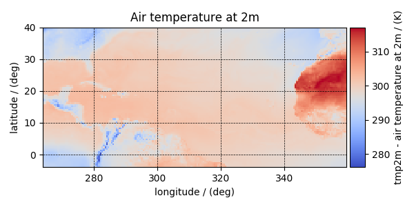
Similarly, other dependent variables with their respective plots are
y[1].name
Out:
'Air temperature at 2m'
plot_scalar(y[1])
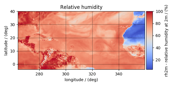
y[3].name
Out:
'Relative humidity'
plot_scalar(y[3])
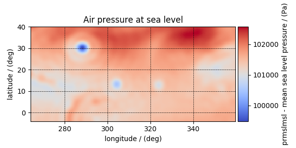
y[4].name
Out:
'Air pressure at sea level'
plot_scalar(y[4])
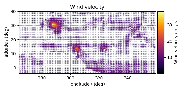
Notice, we skipped the dependent variable at index two. The reason is that this particular dependent variable is a vector dataset,
y[2].quantity_type
Out:
'vector_2'
y[2].name
Out:
'Wind velocity'
which represents the wind velocity, and requires a vector visualization routine. To visualize the vector data, we use the matplotlib quiver plot.
def plot_vector(yx):
    fig, ax = plt.subplots(1, 1, figsize=(6, 3))
    magnitude = np.sqrt(yx.components[0] ** 2 + yx.components[1] ** 2)

    cf = ax.quiver(
        x[0].coordinates,
        x[1].coordinates,
        yx.components[0],
        yx.components[1],
        magnitude,
        pivot="middle",
        cmap="inferno",
    )
    divider = make_axes_locatable(ax)
    cax = divider.append_axes("right", size="5%", pad=0.05)
    cbar = fig.colorbar(cf, cax)
    cbar.ax.set_ylabel(yx.name + " / " + str(yx.unit))

    ax.set_xlim([x[0].coordinates[0].value, x[0].coordinates[-1].value])
    ax.set_ylim([x[1].coordinates[0].value, x[1].coordinates[-1].value])

    # Set axes labels and figure title.
    ax.set_xlabel(x[0].axis_label)
    ax.set_ylabel(x[1].axis_label)
    ax.set_title(yx.name)

    # Set grid lines.
    ax.grid(color="gray", linestyle="--", linewidth=0.5)

    plt.tight_layout()
    plt.show()
plot_vector(y[2])
Total running time of the script: ( 0 minutes 3.009 seconds)