
Note
Click here to download the full example code
Astronomy, 2D{1,1,1} dataset (Creating image composition)
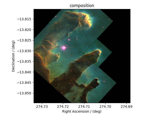
More often, the images in astronomy are a composition of datasets measured at different wavelengths over an area of the sky. In this example, we illustrate the use of the CSDM file-format, and csdmpy module, beyond just reading a CSDM-compliant file. We’ll use these datasets, and compose an image, using Numpy arrays. The following example is the data from the Eagle Nebula acquired at three different wavelengths and serialized as a CSDM compliant file.
Import the csdmpy model and load the dataset.
import csdmpy as cp

filename = "https://osu.box.com/shared/static/of3wmoxcqungkp6ndbplnbxtgu6jaahh.csdf"
eagle_nebula = cp.load(filename)
Let’s get the tuple of dimension and dependent variable objects from
the eagle_nebula instance.
Before we compose an image, let’s take a look at the individual
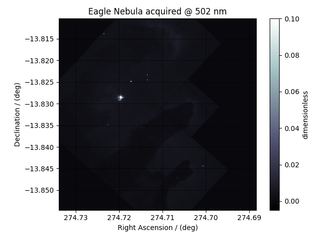
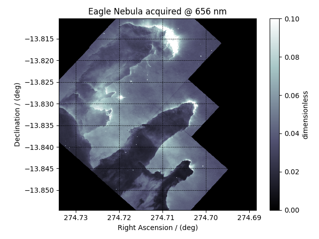
dependent variables from the dataset. The three dependent variables correspond
to signal acquisition at 502 nm, 656 nm, and 673 nm, respectively. This
information is also listed in the
name attribute of the
respective dependent variable instances,
y[0].name
Out:
'Eagle Nebula acquired @ 502 nm'
y[1].name
Out:
'Eagle Nebula acquired @ 656 nm'
y[2].name
Out:
'Eagle Nebula acquired @ 673 nm'
We use the following script to plot the dependent variables.
import matplotlib.pyplot as plt


def plot_scalar(yx):

    # Set the extents of the image plot.
    extent = [
        x[0].coordinates[0].value,
        x[0].coordinates[-1].value,
        x[1].coordinates[0].value,
        x[1].coordinates[-1].value,
    ]

    # Add the image plot.
    y0 = yx.components[0]
    y0 = y0 / y0.max()
    im = plt.imshow(y0, origin="lower", extent=extent, cmap="bone", vmax=0.1)

    # Add a colorbar.
    cbar = plt.gca().figure.colorbar(im)
    cbar.ax.set_ylabel(yx.axis_label[0])

    # Set up the axes label and figure title.
    plt.xlabel(x[0].axis_label)
    plt.ylabel(x[1].axis_label)
    plt.title(yx.name)

    # Set up the grid lines.
    plt.grid(color="k", linestyle="--", linewidth=0.5)

    plt.tight_layout()
    plt.show()
Let’s plot the dependent variables, first dependent variable,
plot_scalar(y[0])
second dependent variable, and
plot_scalar(y[1])
the third dependent variable.
plot_scalar(y[2])
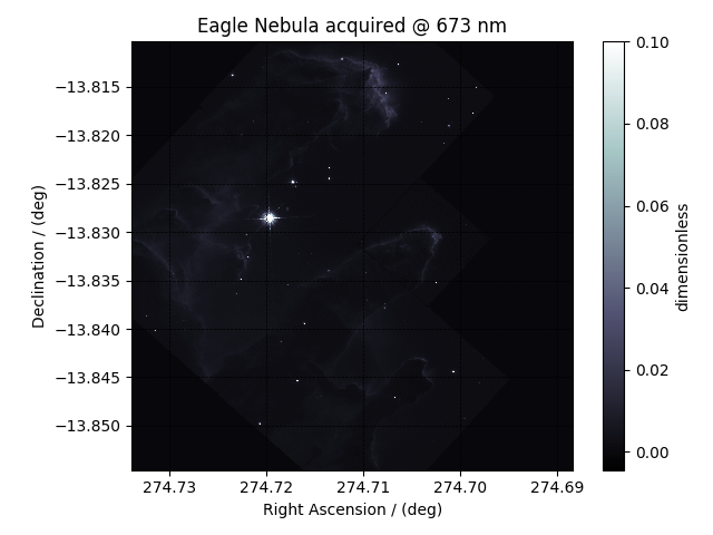
Image composition
import numpy as np
For the image composition, we assign the dependent variable at index zero as the blue channel, index one as the green channel, and index two as the red channel of an RGB image. Start with creating an empty array to hold the RGB dataset.
shape = y[0].components[0].shape + (3,)
image = np.empty(shape, dtype=np.float64)
Here, image is the variable we use for storing the composition. Add
the respective dependent variables to the designated color channel in the
image array,
image[..., 0] = y[2].components[0] / y[2].components[0].max()  # red channel
image[..., 1] = y[1].components[0] / y[1].components[0].max()  # green channel
image[..., 2] = y[0].components[0] / y[0].components[0].max()  # blue channel
Following the intensity plot of the individual dependent variables, see the
above figures, it is evident that the component intensity from y[1] and,
therefore, the green channel dominates the other two. If we
plot the image data, the image will be saturated with green intensity. To
attain a color-balanced image, we arbitrarily scale the intensities from the
three channels. You may choose any scaling factor. Each scaling factor will
produce a different composition. In this example, we use the following,
image[..., 0] = np.clip(image[..., 0] * 65.0, 0, 1)  # red channel
image[..., 1] = np.clip(image[..., 1] * 7.50, 0, 1)  # green channel
image[..., 2] = np.clip(image[..., 2] * 75.0, 0, 1)  # blue channel
Now to plot this composition.
# Set the extents of the image plot.
extent = [
    x[0].coordinates[0].value,
    x[0].coordinates[-1].value,
    x[1].coordinates[0].value,
    x[1].coordinates[-1].value,
]

# add figure
plt.imshow(image, origin="lower", extent=extent)

plt.xlabel(x[0].axis_label)
plt.ylabel(x[1].axis_label)
plt.title("composition")

plt.tight_layout()
plt.show()
Total running time of the script: ( 0 minutes 5.580 seconds)