Correlated Dataset
The Core Scientific Dataset Model (CSDM) supports multiple dependent variables that share the same d-dimensional coordinate grid, where \(d>=0\). We call the dependent variables from these datasets as correlated datasets.
In this section, we go over a few examples.
Scatter, 0D{1,1} dataset
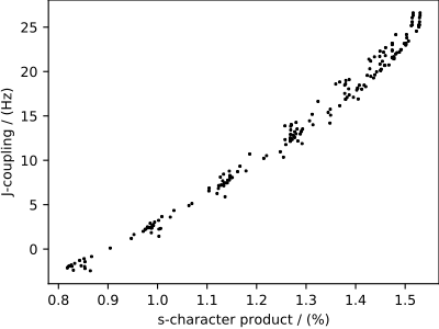
We start with a 0D{1,1} correlated dataset, that is, a dataset without a coordinate grid. A 0D{1,1} dataset has no dimensions, d = 0, and two single-component dependent variables. In the following example, the two correlated dependent variables are the \(^{29}\text{Si}\) - \(^{29}\text{Si}\) nuclear spin couplings, \(^2J\), across a Si-O-Si linkage, and the s-character product on the O and two Si along the Si-O bond across the Si-O-Si linkage.
Let’s import the dataset.
>>> import csdmpy as cp
>>> filename = 'Test Files/correlatedDataset/0D_dataset/J_vs_s.csdf'
>>> zero_d_dataset = cp.load(filename)
Since the dataset has no dimensions, the value of the
dimensions attribute of the CSDM
class is an empty tuple,
>>> print(zero_d_dataset.dimensions)
()
The dependent_variables attribute, however, holds
two dependent-variable objects. The data structure from the two dependent
variables is
>>> print(zero_d_dataset.dependent_variables[0].data_structure)
{
  "type": "internal",
  "name": "Gaussian computed J-couplings",
  "unit": "Hz",
  "quantity_name": "frequency",
  "numeric_type": "float32",
  "quantity_type": "scalar",
  "component_labels": [
    "J-coupling"
  ],
  "components": [
    [
      "-1.87378, -1.42918, ..., 25.1742, 26.0608"
    ]
  ]
}
and
>>> print(zero_d_dataset.dependent_variables[1].data_structure)
{
  "type": "internal",
  "name": "product of s-characters",
  "unit": "%",
  "numeric_type": "float32",
  "quantity_type": "scalar",
  "component_labels": [
    "s-character product"
  ],
  "components": [
    [
      "0.8457453, 0.8534185, ..., 1.5277092, 1.5289451"
    ]
  ]
}
respectively.
The correlation plot of the dependent-variables from the dataset is shown below.
Tip
Plotting a scatter plot.
>>> import matplotlib.pyplot as plt
>>> def plot_scatter():
...     plt.figure(figsize=(4,3))
...
...     y0 = zero_d_dataset.dependent_variables[0]
...     y1 = zero_d_dataset.dependent_variables[1]
...
...     plt.scatter(y1.components[0], y0.components[0], s=2, c='k')
...     plt.xlabel(y1.axis_label[0])
...     plt.ylabel(y0.axis_label[0])
...     plt.tight_layout(pad=0, w_pad=0, h_pad=0)
...     plt.show()
>>> plot_scatter()
Meteorological, 2D{1,1,2,1,1} dataset
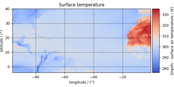
The following dataset is obtained from NOAA/NCEP Global Forecast System (GFS) Atmospheric Model and subsequently converted to the CSD model file-format. The dataset consists of two spatial dimensions describing the geographical coordinates of the earth surface and five dependent variables with 1) surface temperature, 2) air temperature at 2 m, 3) relative humidity, 4) air pressure at sea level as the four scalar quantity_type dependent variable, and 5) wind velocity as the two-component vector, quantity_type dependent variable.
Let’s import the csdmpy module and load this dataset.
>>> import csdmpy as cp

>>> filename = 'Test Files/correlatedDataset/forecast/NCEI.csdfe'
>>> multi_dataset = cp.load(filename)
The tuple of dimension and dependent variable objects from
multi_dataset instance are
>>> x = multi_dataset.dimensions
>>> y = multi_dataset.dependent_variables
The dataset contains two dimension objects representing the longitude and latitude of the earth’s surface. The respective dimensions are labeled as
>>> x[0].label
'longitude'

>>> x[1].label
'latitude'
There are a total of five dependent variables stored in this dataset. The first dependent variable is the surface air temperature. The data structure of this dependent variable is
>>> print(y[0].data_structure)
{
  "type": "internal",
  "description": "The label 'tmpsfc' is the standard attribute name for 'surface air temperature'.",
  "name": "Surface temperature",
  "unit": "K",
  "quantity_name": "temperature",
  "numeric_type": "float64",
  "quantity_type": "scalar",
  "component_labels": [
    "tmpsfc - surface air temperature"
  ],
  "components": [
    [
      "292.8152160644531, 293.0152282714844, ..., 301.8152160644531, 303.8152160644531"
    ]
  ]
}
If you have followed all previous examples, the above data structure should be self-explanatory.
The following snippet plots a dependent variable of scalar quantity_type.
Tip
Plotting a scalar intensity plot
>>> import numpy as np
>>> import matplotlib.pyplot as plt
>>> from mpl_toolkits.axes_grid1 import make_axes_locatable

>>> def plot_scalar(yx):
...     fig, ax = plt.subplots(1,1, figsize=(6,3))
...
...     # Set the extents of the image plot.
...     extent = [x[0].coordinates[0].value, x[0].coordinates[-1].value,
...               x[1].coordinates[0].value, x[1].coordinates[-1].value]
...
...     # Add the image plot.
...     im = ax.imshow(yx.components[0], origin='lower', extent=extent,
...                    cmap='coolwarm')
...
...     # Add a colorbar.
...     divider = make_axes_locatable(ax)
...     cax = divider.append_axes("right", size="5%", pad=0.05)
...     cbar = fig.colorbar(im, cax)
...     cbar.ax.set_ylabel(yx.axis_label[0])
...
...     # Set up the axes label and figure title.
...     ax.set_xlabel(x[0].axis_label)
...     ax.set_ylabel(x[1].axis_label)
...     ax.set_title(yx.name)
...
...     # Set up the grid lines.
...     ax.grid(color='k', linestyle='--', linewidth=0.5)
...
...     plt.tight_layout(pad=0, w_pad=0, h_pad=0)
...     plt.show()
Now to plot the data from the dependent variable.
>>> plot_scalar(y[0])
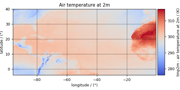
Similarly, other dependent variables with their respective plots are
>>> y[1].name
'Air temperature at 2m'
>>> plot_scalar(y[1])
>>> y[3].name
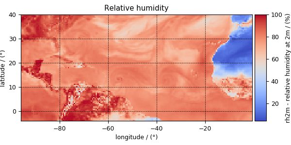
'Relative humidity'
>>> plot_scalar(y[3])
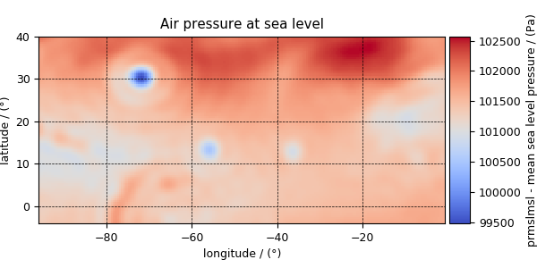
>>> y[4].name
'Air pressure at sea level'
>>> plot_scalar(y[4])
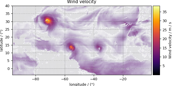
Notice, we skipped the dependent variable at index two. The reason is that this particular dependent variable is a vector dataset,
>>> y[2].quantity_type
'vector_2'
>>> y[2].name
'Wind velocity'
which represents the wind velocity, and requires a vector visualization routine. To visualize the vector data, we use the matplotlib quiver plot.
Tip
Vector quiver plot
>>> def plot_vector(yx):
...     fig, ax = plt.subplots(1,1, figsize=(6,3))
...     X, Y = np.meshgrid(x[0].coordinates, x[1].coordinates)
...     magnitude = np.sqrt(yx.components[0]**2 + yx.components[1]**2)
...
...     cf = ax.quiver(x[0].coordinates, x[1].coordinates,
...                    yx.components[0], yx.components[1],
...                    magnitude, pivot ='middle', cmap='inferno')
...     divider = make_axes_locatable(ax)
...     cax = divider.append_axes("right", size="5%", pad=0.05)
...     cbar = fig.colorbar(cf, cax)
...     cbar.ax.set_ylabel(yx.name+' / '+str(yx.unit))
...
...     ax.set_xlim([x[0].coordinates[0].value, x[0].coordinates[-1].value])
...     ax.set_ylim([x[1].coordinates[0].value, x[1].coordinates[-1].value])
...
...     # Set axes labels and figure title.
...     ax.set_xlabel(x[0].axis_label)
...     ax.set_ylabel(x[1].axis_label)
...     ax.set_title(yx.name)
...
...     # Set grid lines.
...     ax.grid(color='gray', linestyle='--', linewidth=0.5)
...
...     plt.tight_layout(pad=0, w_pad=0, h_pad=0)
...     plt.show()
>>> plot_vector(y[2])
Astronomy, 2D{1,1,1} dataset (Creating image composition)
More often, the images in astronomy are a composition of datasets measured at different wavelengths over an area of the sky. In this example, we illustrate the use of the CSDM file-format, and csdmpy module, beyond just reading a CSDM-compliant file. We’ll use these datasets, and compose an image, using Numpy arrays. The following example is the data from the Eagle Nebula acquired at three different wavelengths and serialized as a CSDM compliant file. Import the csdmpy model and load the dataset.
>>> import csdmpy as cp
>>> import matplotlib.pyplot as plt

>>> filename = 'Test Files/EagleNebula/eagleNebula.csdfe'
>>> eagle_nebula = cp.load(filename)
Let’s get the tuple of dimension and dependent variable objects from
the eagle_nebula instance.
>>> x = eagle_nebula.dimensions
>>> y = eagle_nebula.dependent_variables
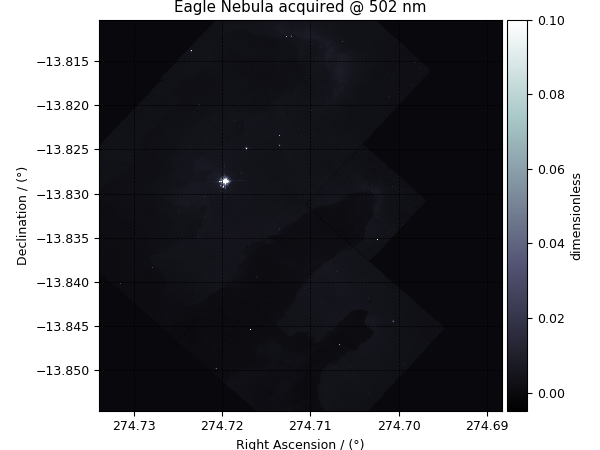
Before we compose an image, let’s take a look at the individual
dependent variables from the dataset. The three dependent variables correspond
to signal acquisition at 502 nm, 656 nm, and 673 nm, respectively. This
information is also listed in the
name attribute of the
respective dependent variable instances,
>>> y[0].name
'Eagle Nebula acquired @ 502 nm'
>>> y[1].name
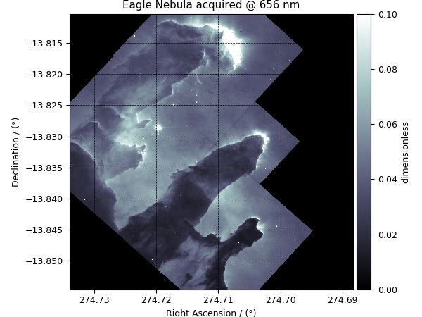
'Eagle Nebula acquired @ 656 nm'
>>> y[2].name
'Eagle Nebula acquired @ 673 nm'
Tip
A script for an intensity plot.
>>> import matplotlib.pyplot as plt
>>> from mpl_toolkits.axes_grid1 import make_axes_locatable
>>> from matplotlib.colors import LogNorm

>>> def plot_scalar(yx):
...     plt.figure(figsize=(6,4.5))
...
...     # Set the extents of the image plot.
...     extent = [x[0].coordinates[0].value, x[0].coordinates[-1].value,
...               x[1].coordinates[0].value, x[1].coordinates[-1].value]
...
...     # Add the image plot.
...     y0 = yx.components[0]
...     y0 = y0/y0.max()
...     im = plt.imshow(y0, origin='lower', extent=extent, cmap='bone', vmax=0.1)
...
...     # Add a colorbar.
...     divider = make_axes_locatable(plt.gca())
...     cax = divider.append_axes("right", size="5%", pad=0.05)
...     cbar = plt.gca().figure.colorbar(im, cax)
...     cbar.ax.set_ylabel(yx.axis_label[0])
...
...     # Set up the axes label and figure title.
...     plt.xlabel(x[0].axis_label)
...     plt.ylabel(x[1].axis_label)
...     plt.title(yx.name)
...
...     # Set up the grid lines.
...     plt.grid(color='k', linestyle='--', linewidth=0.5)
...
...     plt.tight_layout(pad=0, w_pad=0, h_pad=0)
...     plt.show()
Let’s plot the dependent variables, first dependent variable,
>>> plot_scalar(y[0])
second dependent variable, and
>>> plot_scalar(y[1])
the third dependent variable.
>>> plot_scalar(y[2])

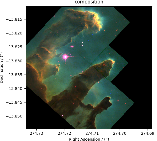
Image composition
For the image composition, we assign the dependent variable at index zero as the blue channel, index one as the green channel, and index two as the red channel of an RGB image. Start with creating an empty array to hold the RGB dataset.
>>> shape = y[0].components[0].shape + (3,)
>>> image = np.empty(shape, dtype=np.float64)
Here, image is the variable we use for storing the composition. Add
the respective dependent variables to the designated color channel in the
image array,
>>> image[...,0] = y[2].components[0]/y[2].components[0].max() # red channel
>>> image[...,1] = y[1].components[0]/y[1].components[0].max() # green channel
>>> image[...,2] = y[0].components[0]/y[0].components[0].max() # blue channel
Following the intensity plot of the individual dependent variables, see the
above figures, it is evident that the component intensity from y[1] and,
therefore, the green channel dominates the other two. If we
plot the image data, the image will be saturated with green intensity. To
attain a color-balanced image, we arbitrarily scale the intensities from the
three channels. You may choose any scaling factor. Each scaling factor will
produce a different composition. In this example, we use the following,
>>> image[...,0] = image[...,0]*65.0 # red channel
>>> image[...,1] = image[...,1]*7.5  # green channel
>>> image[...,2] = image[...,2]*75.0 # blue channel
Now to plot this composition.
>>> def image_composition():
...     # Set the extents of the image plot.
...     extent = [x[0].coordinates[0].value, x[0].coordinates[-1].value,
...               x[1].coordinates[0].value, x[1].coordinates[-1].value]
...
...     # add figure
...     plt.figure(figsize=(5,4.5))
...     plt.imshow(image, origin='lower', extent=extent)
...
...     plt.xlabel(x[0].axis_label)
...     plt.ylabel(x[1].axis_label)
...     plt.title('composition')
...
...     plt.tight_layout(pad=0, w_pad=0, h_pad=0)
...     plt.show()
>>> image_composition()